Solloco
Packaging Design
BRAND IDENTITY
Solloco is a high-end self care line for creatives. The brand name comes from the Greek words “sollertia”, meaning artistic skill and “voco”, meaning to summon. Inspired by the dedication of artists who show up and do “the work” day after day, Solloco meets creative needs through fragrance.
CONCEPT
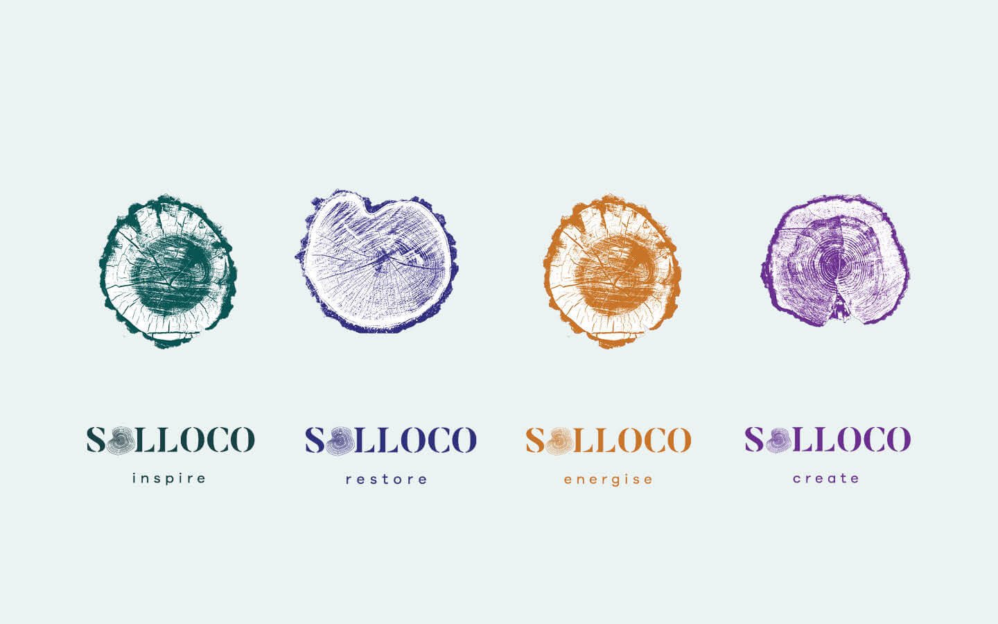
The four product lines are built around the idea of using specific scents to meet corresponding needs. Products from the “inspire” line help get ideas flowing, “create” gets artists in the zone, “energise” helps creatives to keep at it when their energy lags and, finally, the “restore” range is about rewarding effort.
Creatives can choose which product to use depending on where they are in the creative cycle. They might light a candle from the “inspire” line to summon fresh ideas, build a pre-creation ritual of indulging in a few drops of serum from the “create” line just before approaching their work or indulge in rich hand cream from the “restore” line to reward themselves after a day’s creating.
GRAPHIC ELEMENTS
Tree rings symbolise commitment separated from outcome. Each individual tree ring represents a period of artistic growth.
The second graphic element, fingerprints echo tree rings and represent the concept of creativity passing through an artist rather than coming from them. It’s in this balance between commitment to hard work and the alchemy of making something from nothing that creativity lives.
Stephen King warns creatives not to wait for the muse: “Your job is to make sure the muse knows where you’re going to be every day from nine till noon or seven till three. If he does know, I assure you that sooner or later he’ll start showing up, chomping his cigar and making his magic”.
The brand slogan “be inspired” marks Solloco’s pursuit of creativity through unique sensory experiences, which become an enjoyable and rewarding part of showing up every day.


